What Is a Mood Board? Examples and How to Make One
- Sits under
- Creative
- Posted
- Read time, roughly
- 4 min
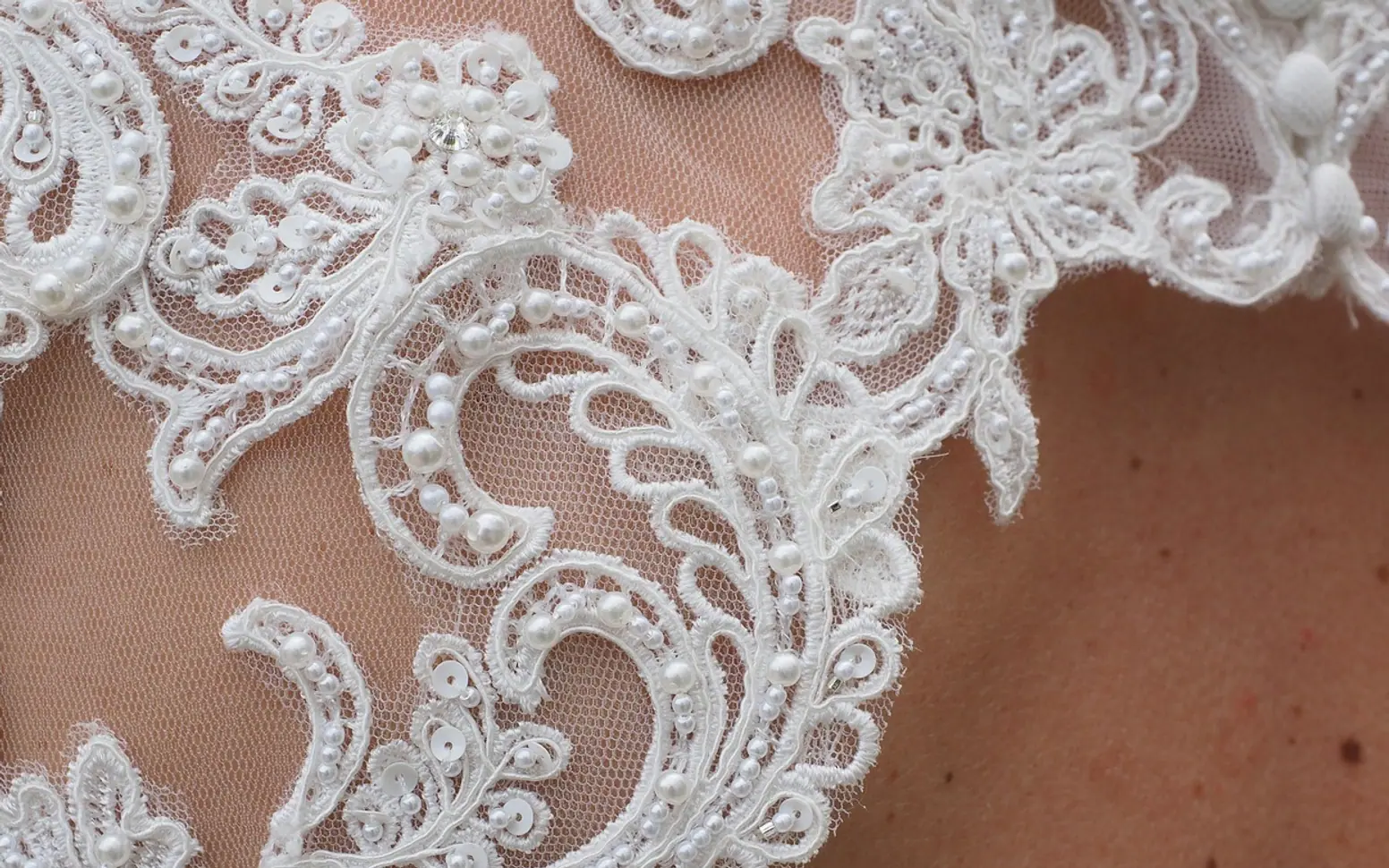
A mood board is a collage of images, colours, typefaces, textures and a few words that shows the look and feel a project should have before the real design work begins. It gives everyone involved, whether a client, a team or just yourself, a shared picture to point at, which is far easier than agreeing on adjectives like "fresh" or "premium" in the abstract. Mood boards are used in branding, interiors, websites and apps, film, fashion and events.
What a mood board is for
Words describing style mean different things to different people. One person's "minimal" is white space and thin type; another's is raw concrete and black steel. A mood board settles that early, when changing direction costs a conversation rather than a redesign. It also acts as a reference during the project: when a decision feels uncertain, the board shows whether a choice fits the direction everyone agreed.
A mood board is not a final design. It collects references and atmosphere, while a style guide later records the exact colours, fonts and rules a finished brand or product uses.
Mood board examples by project
| Project | What usually goes on the board |
|---|---|
| Brand identity | Colour swatches, type samples, logo references from unrelated fields, textures, a few words about personality |
| Website or app | Interface screenshots for layout ideas, icon styles, photography style, button and card shapes |
| Interior room | Furniture, materials, fabric and paint samples, lighting, a floor plan sketch |
| Video or photo shoot | Lighting references, colour grades, locations, wardrobe, framing |
| Event or wedding | Table settings, flowers, stationery, signage, a palette |
| Product packaging | Shelf photos, materials, label styles, sticker and print finishes |
Physical or digital
A physical board, made of cut-outs, fabric scraps and paint chips pinned to foam board, is still useful where touch matters, such as interiors and fashion. Digital boards are quicker to share and edit, and they handle screenshots, video stills and links naturally. Many designers build in a whiteboard app, a presentation tool or a layout program and export a single image or PDF to share. Vector icons and logo sketches drop in cleanly from an online SVG editor, and stay sharp at any zoom level.
How to make a mood board in seven steps
- Write the brief in three words. Choose words that describe the feeling, not the content: "calm, crafted, outdoorsy" is more useful than "website for a bakery".
- Collect widely. Gather far more references than you need from photography, architecture, packaging, nature and old print. Looking beyond your own field avoids copying competitors.
- Cut ruthlessly. Remove anything that does not match the three words. A board with a dozen strong pieces says more than one with fifty.
- Pull out a palette. Sample four to six colours from the images that remain and show them as swatches.
- Add type and texture. Include a heading and body font sample, and a material or surface if it matters.
- Arrange with hierarchy. Give the most representative image the most space and group related items so the board reads at a glance.
- Annotate and share. Short notes such as "this light, not this colour" prevent misunderstandings. Ask for feedback on direction, not on individual images.
Mistakes that weaken a board
- Two directions on one page. If the board looks undecided, make two boards and ask people to choose.
- Only screenshots of competitors. The result tends to look like everyone else in the market.
- No words at all. A few labels explain why an image is there and what to take from it.
- Treating references as assets. Images collected for inspiration usually belong to someone else, so they guide the work rather than appear in it.
From board to finished work
Once a direction is agreed, the board feeds real decisions. A palette becomes brand colours; a lighting reference becomes a grading choice for video, which is where tools like colour grading lookup tables come in; a texture becomes a print finish on custom printed stickers or packaging. Keeping the board pinned in the project folder lets anyone joining later understand the intent in a minute.
Common questions
How many images should a mood board have?
There is no fixed number. Enough to show the direction clearly without repeating the same idea; many effective boards use between eight and twenty pieces.
Is a mood board the same as a vision board?
They look similar, but a vision board collects personal goals and aspirations, while a mood board defines the visual style of a specific project.
Should a mood board include text?
Yes, a little. The three brief words, colour names and short notes help viewers read the board the way it was intended.
Fresh in every section
Good places to start
 InsurancePet Insurance Waiting Periods: How They Work Before Cover Starts4 min
 GardeningWhy Are My Solar Lights Not Working? Simple Checks and Fixes4 min
 Real estateImpact of Singapore’s Real Estate Boom on Local Communities2 min
 Social MediaThe Cost of Ignoring SEO: What Montreal Businesses Risk Losing2 min
Questions? Write to us.
Suggestions help us plan.